
A Simpler Tulip Talk on Your Phone — What We're Changing and Why
By Tulip Talk Team ·
This week someone left us a review on Google Play. They said Tulip Talk is useful for learning Dutch, but that the interface could be simpler. That is a fair thing to say, and instead of guessing what they meant, we took out a phone and measured.
What we found
We opened the signed-in app on an ordinary phone and looked at the very first screen, before any scrolling.
- With the practice menu open, menus and bars filled 84% of the screen. The part that is actually about learning Dutch got the remaining 16%.
- With the menu closed, navigation still took more than a third of the screen before the first piece of Dutch appeared.
- The button that says what to do next, "Your next step", was below the edge of the screen. You had to scroll to find the one thing the home page exists for.
- In Talk, the box where you type your message was off-screen. In Speak, so was the microphone button.
- The Account page was a single scroll of about twenty sections, from your avatar all the way down to your sign-in history.
None of this is a bug in the usual sense. Every feature works. There is simply too much on the screen at once, and a phone has very little screen.
The Dutch have a saying for this: minder is meer. Less is more.
What we are going to change
1. Your next step comes first. The home screen becomes "Today": a greeting, one clear button for your next lesson, and at most three small reminders, such as words due for review. It fits on one screen. No scrolling to find out what to do.
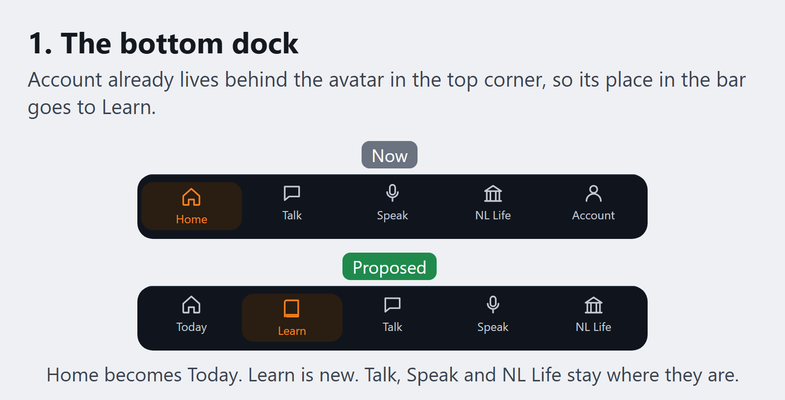
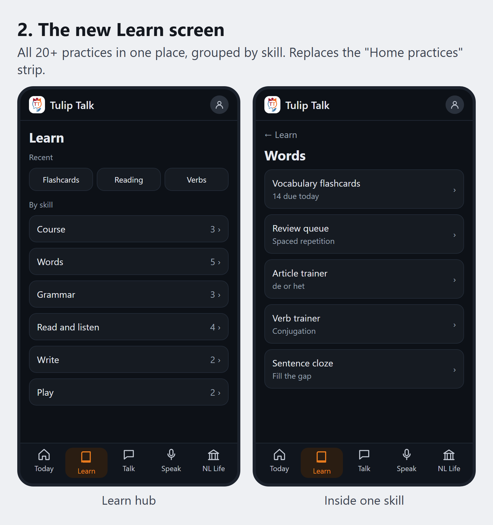
2. A new Learn button in the bottom bar. Today the bar reads Home, Talk, Speak, NL Life, Account. Account is already behind your avatar in the top corner, so that spot goes to Learn: every practice in one place, grouped the way you think about it. Course, Words, Grammar, Read and listen, Write, Play. Your three most recent activities sit on top.
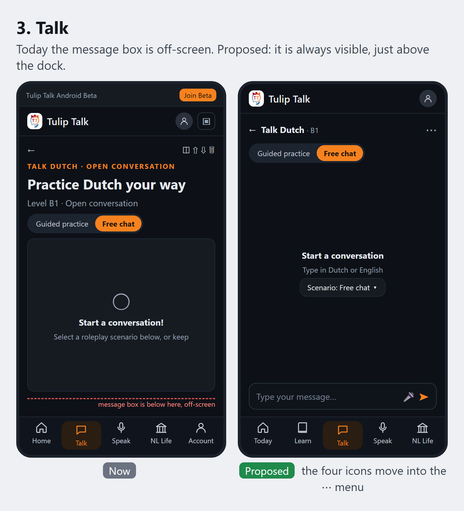
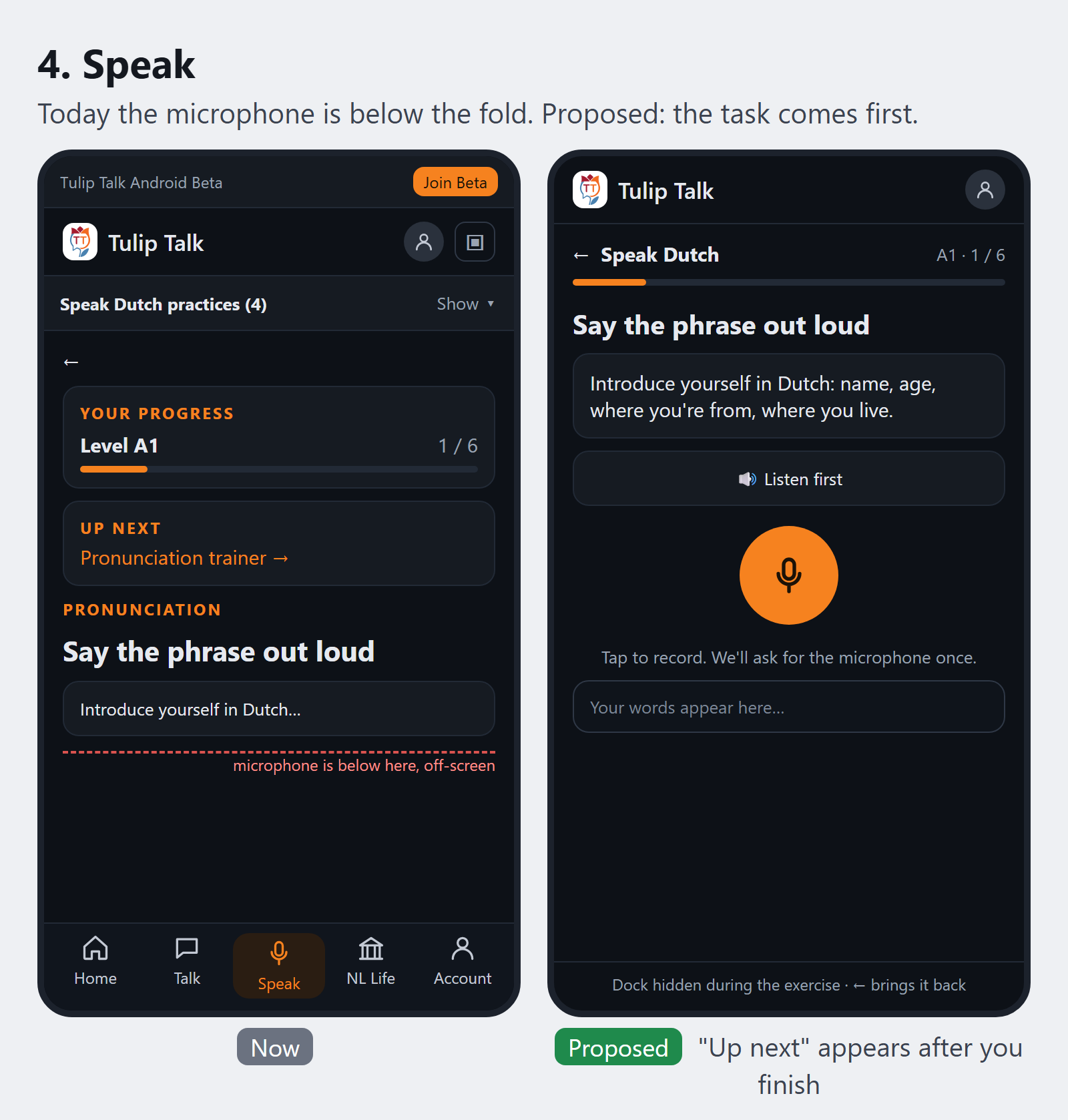
3. The exercise gets the screen. In Talk, the message box stays pinned where your thumb is, and the four small icons move into one menu. In Speak, the phrase and the microphone come first, and "up next" appears after you finish rather than before you start. While you are in an exercise, the bottom bar steps out of the way.
4. Buttons you can actually hit. Every button in the navigation will be at least 44 pixels, which is roughly the size of a fingertip. The "small" button size stays available on a computer with a mouse, but not on a touch screen, where it only causes mis-taps.
5. Phones always get the bottom bar. You can choose between three navigation layouts, and that choice followed you from your laptop to your phone, where a side rail makes no sense. From now on a phone held upright always uses the bottom bar. Your layout choice still applies when you turn the phone sideways, and on larger screens.
6. Account becomes a short menu. Profile, Appearance, Learning and reminders, AI, Security, Data and privacy, About. Tap one, see one page.
7. One tulip. The logo in the app store and the logo inside the app were two different flowers. You will see the same tulip everywhere.
What is not changing
- Nothing is being removed. Every practice, setting and tool stays. This is about order and space, not about taking features away.
- Dutch stays at the centre. Lessons, vocabulary and expected answers remain Dutch whichever interface language you use.
- Accessibility stays a requirement, not an extra. Dutch text keeps its language marking so screen readers pronounce it correctly, reduced-motion settings are respected, and the celebration confetti will no longer fall over the buttons.
- On a tablet or computer you keep your choice of layout.
When
We are building this in small steps rather than one big release, so each change can be tested on real phones before the next one lands. The bottom-bar rule and the larger buttons come first, then Account and the new home screen, then Learn, Talk and Speak. We are not going to promise dates we cannot keep. Each step will be listed in the release notes when it ships.
Tell us when something is off
That Play review was one sentence long, and it sent us to a ruler and a phone. If something in Tulip Talk gets in your way, tell us on the feedback page. If you are signed in to Tulip Talk it recognises you automatically; otherwise you sign in with your Tulip Talk account, which keeps fake reviews and spam out. We are also adding a "Report a problem" option under your avatar that fills in the technical details for you, so all you have to write is what happened.
Thank you to everyone testing the Android app. You are the reason this is getting better.
Practise this, don't just read it
Tulip Talk turns Dutch grammar into CEFR-laddered practice — sentence building, pronunciation with reference audio, and exam simulations. Free to start.